At a glance
Turning a UI enhancement into a product-level UX intervention
The problem: A growing enterprise application had become difficult to navigate. Home acted as the gateway to functional areas, while the same table model was being used for fundamentally different types of work.
My contribution: I identified that the underlying issue was structural, proposed a broader information-architecture and experience overhaul, and secured PM approval. As the sole designer, I worked closely with developers and senior management to shape navigation, data-heavy workflows, system behavior and the platform-specific component library.
The outcome: I delivered a revised IA and Phase 1 header navigation, designed two table models and configurable views, and built a platform-specific component library — giving subsequent feature work a clearer foundation.
The challenge
A rigid structure, mixed access, and one table model doing too much
Over time the product had accumulated functional areas that were hard to move between consistently. Home sat at the center, and dense tables carried most of the actual work — business data, logs, monitoring and administration, often with the same interaction pattern.
Access was not uniform: Regular Users, Super Users — including Investment and Financial Approvers — and Administrators could view, edit, manage or act on different things in the same areas.
My role
The pivot: from UI enhancement to IA and experience overhaul
The initial assignment was a UI enhancement. The structural issues would not be solved by restyling screens, so I proposed a broader overhaul of information architecture and experience and secured PM approval to pursue it.
As the sole designer, I owned the UX and UI design direction across the initiative: navigation, Home and functional areas, data-table concepts, Search Results, system behavior and the platform-specific component library. I collaborated day to day with the client-side PM and developers, and aligned the work with senior management.
Direct access to end users was limited, so I worked through close collaboration with product and business stakeholders. I challenged requirements around purpose, dependencies, technical constraints, compliance considerations, edge cases and expected outcomes — rather than treating them as a finished set of screens.
Information architecture
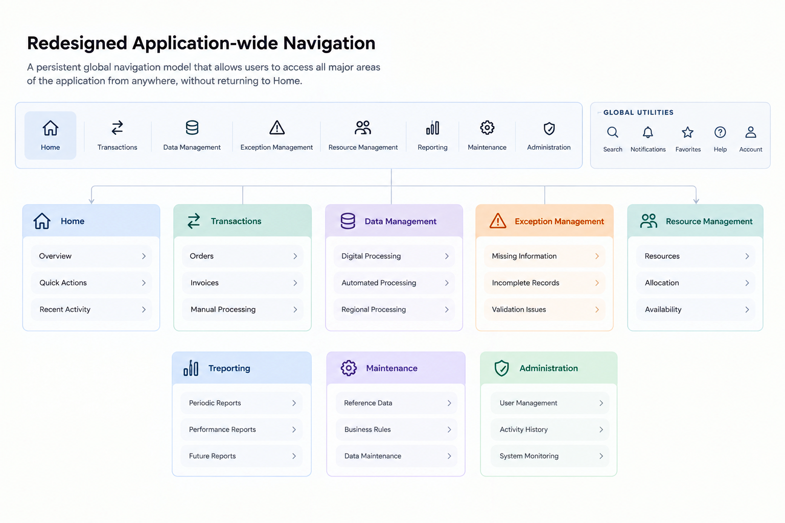
The redesign started with the structure, not the home screen
I mapped the existing information architecture to understand how functional areas were organized and how people moved between them. The original model made Home a mandatory starting point: Home → Functional area → Subsection → Table.
The proposed structure made the functional areas independently reachable through persistent global navigation. Home could then do what it was better suited for: act as a quick-access hub for frequently used sections and cards, rather than a mandatory gateway. The proposed structure is shown first. The comparison below then illustrates how the change affected the Home experience: from a collection of entry points to a working hub, with the main areas reachable through persistent navigation.
The Home experience
From a navigation gateway to a working hub
The IA change was not only structural. It changed the role of Home in the day-to-day experience: users no longer had to return to a central landing page to move between functional areas.
Before · Legacy Home
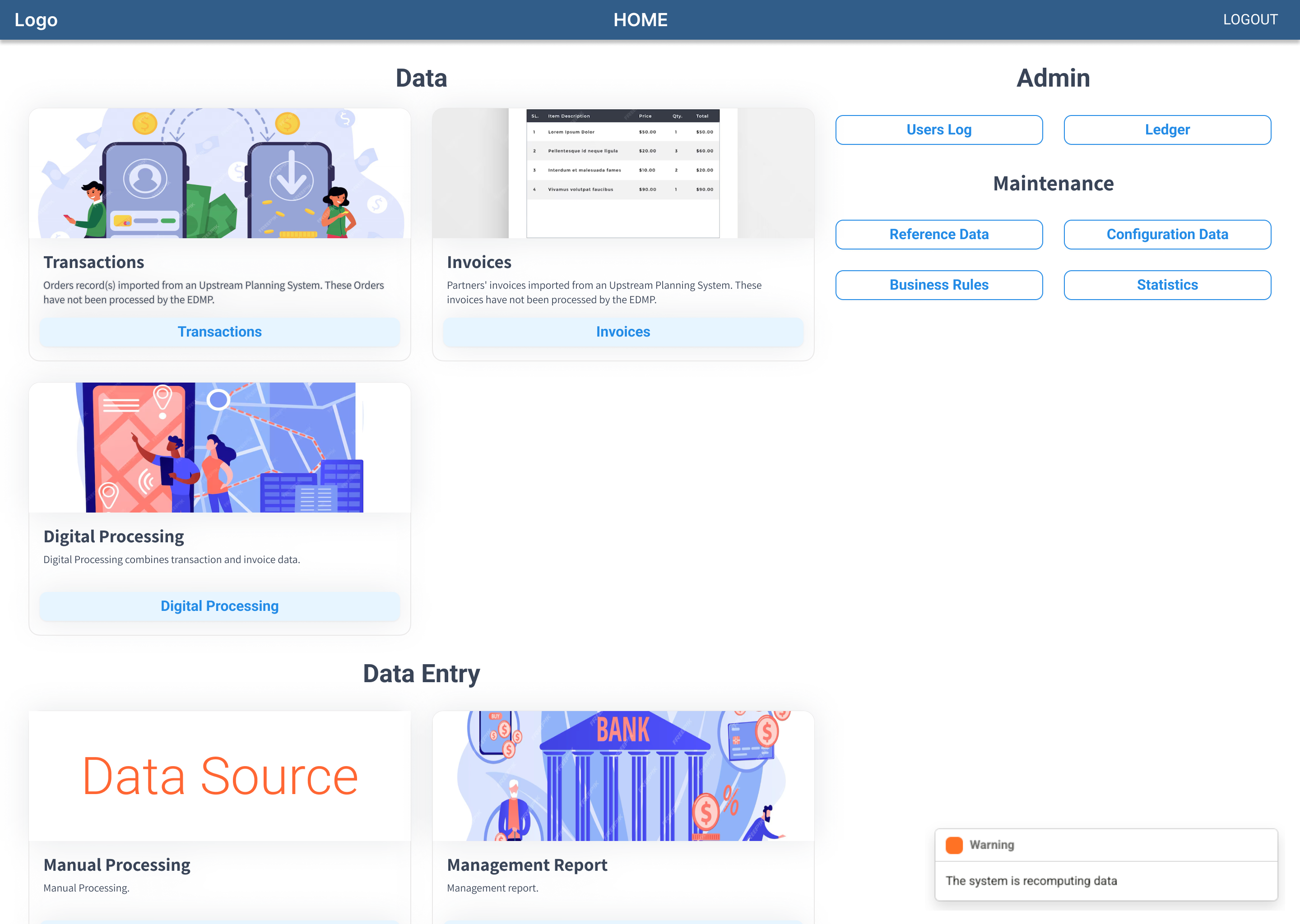
Home acted as the main gateway. Users selected an area here, then returned to Home to move elsewhere.
After · Redesigned Home
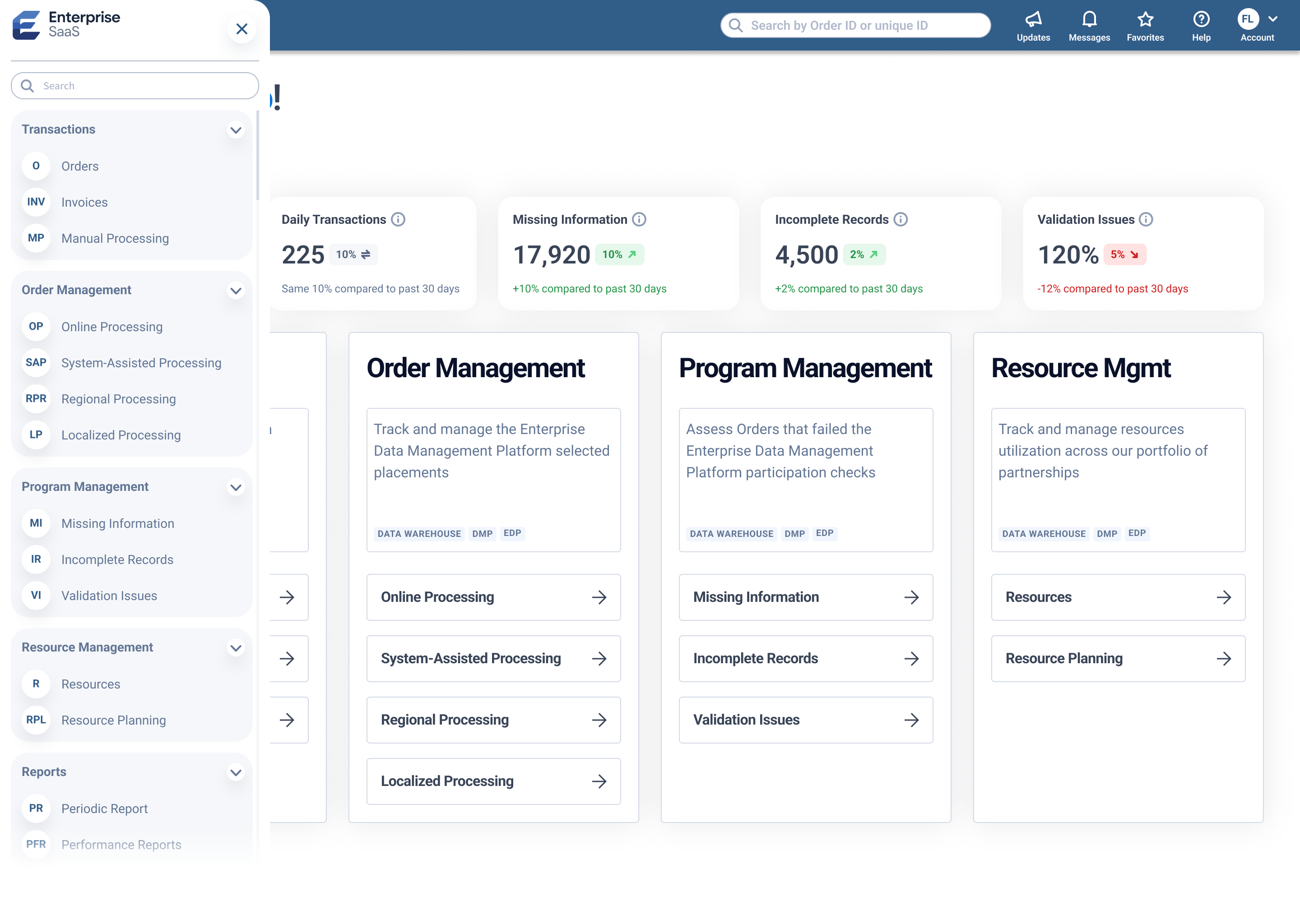
Home became a quick-access hub for frequently used sections and cards. Persistent navigation made the wider application directly reachable.
Roles and permissions
Access was part of the UX architecture
Permissions were designed as part of the UX architecture, not as an isolated administrative concern. The work started from the highest, most complete access level, then identified what changed for each user type.
Those differences showed up in User Profile, User Permissions, user management, Administrator-only actions, role-specific actions inside functional areas, and Read Only versus Edit.
Data
The data table had become a product of its own
The platform depended on densely populated tables. Relationships and actions changed from one section to the next, and the same interaction model was being asked to support both business work and maintenance work.
Data experience
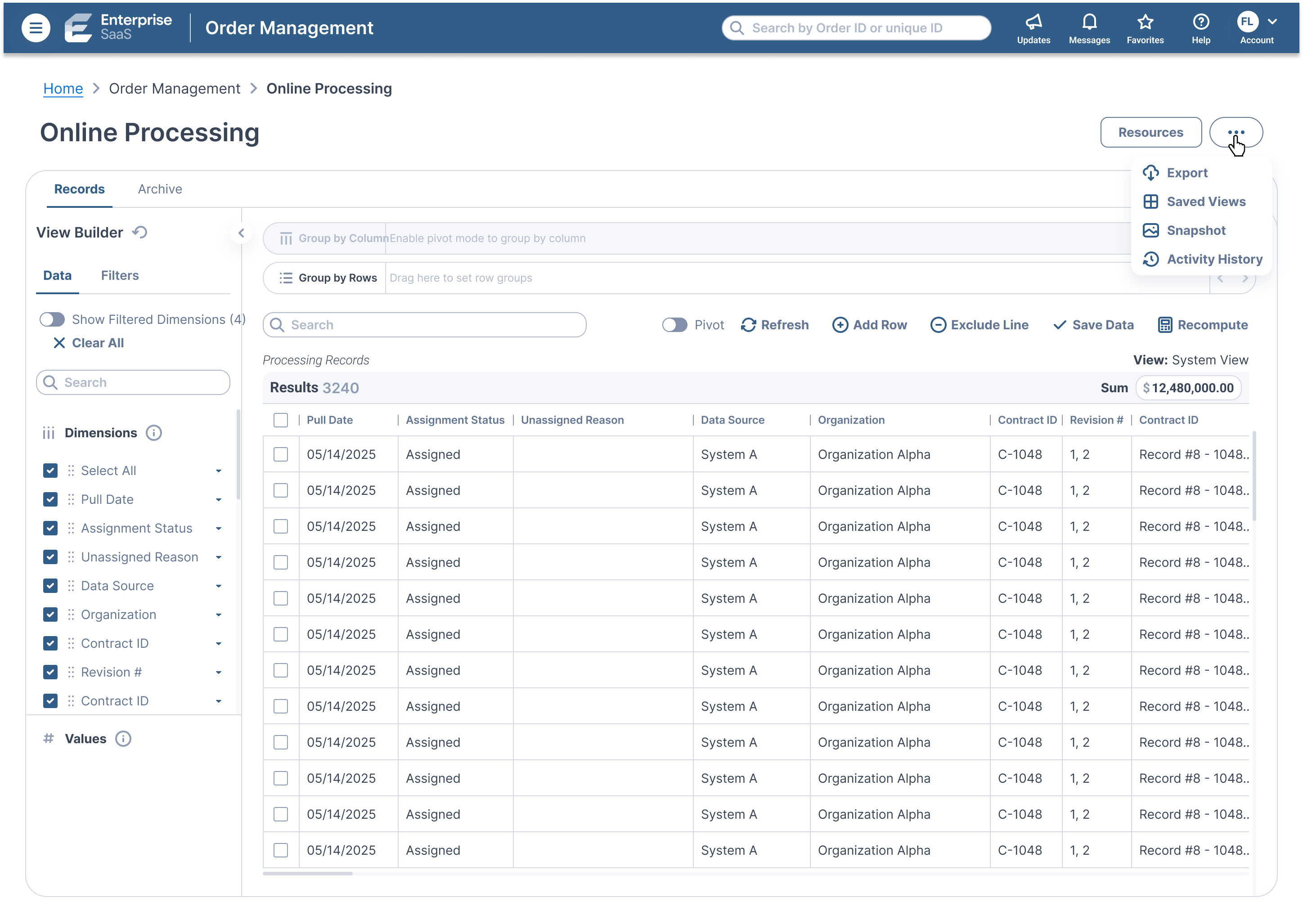
Designing two table models and a configurable data workspace
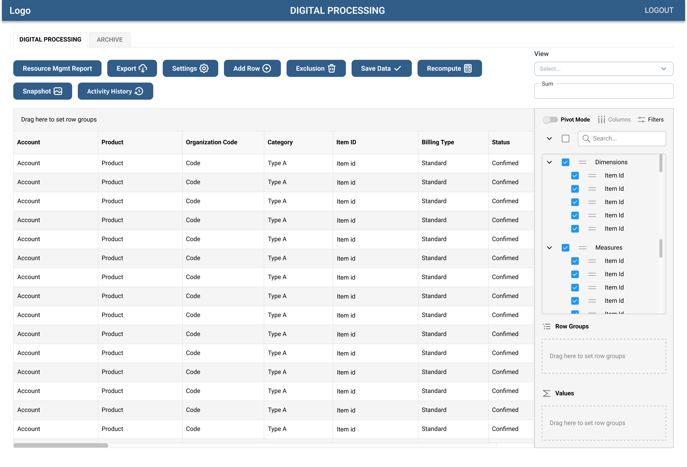
I designed two distinct table models to address different jobs. Data Tables were intended for core functional and business data. Zebra Tables were designed for logs, monitoring, user management and related maintenance work. The design separated business-data workflows from operational and administrative tasks.
I also audited the legacy tables section by section, identifying which dimensions were essential in each context. The proposed approach was intended to reduce unnecessary horizontal scrolling while keeping less frequently used dimensions available on demand.
The View Builder was designed to make data views configurable through dimensions, filters, grouping and saved views — rather than locking people into one predefined layout. The implementation retained a hybrid AG Grid appearance: the concepts were designed, but the proposed table models and View Builder were not delivered as a complete replacement.
Findability
Finding a record without learning the application first
As records and functional areas multiplied, finding the right information became part of the product problem.
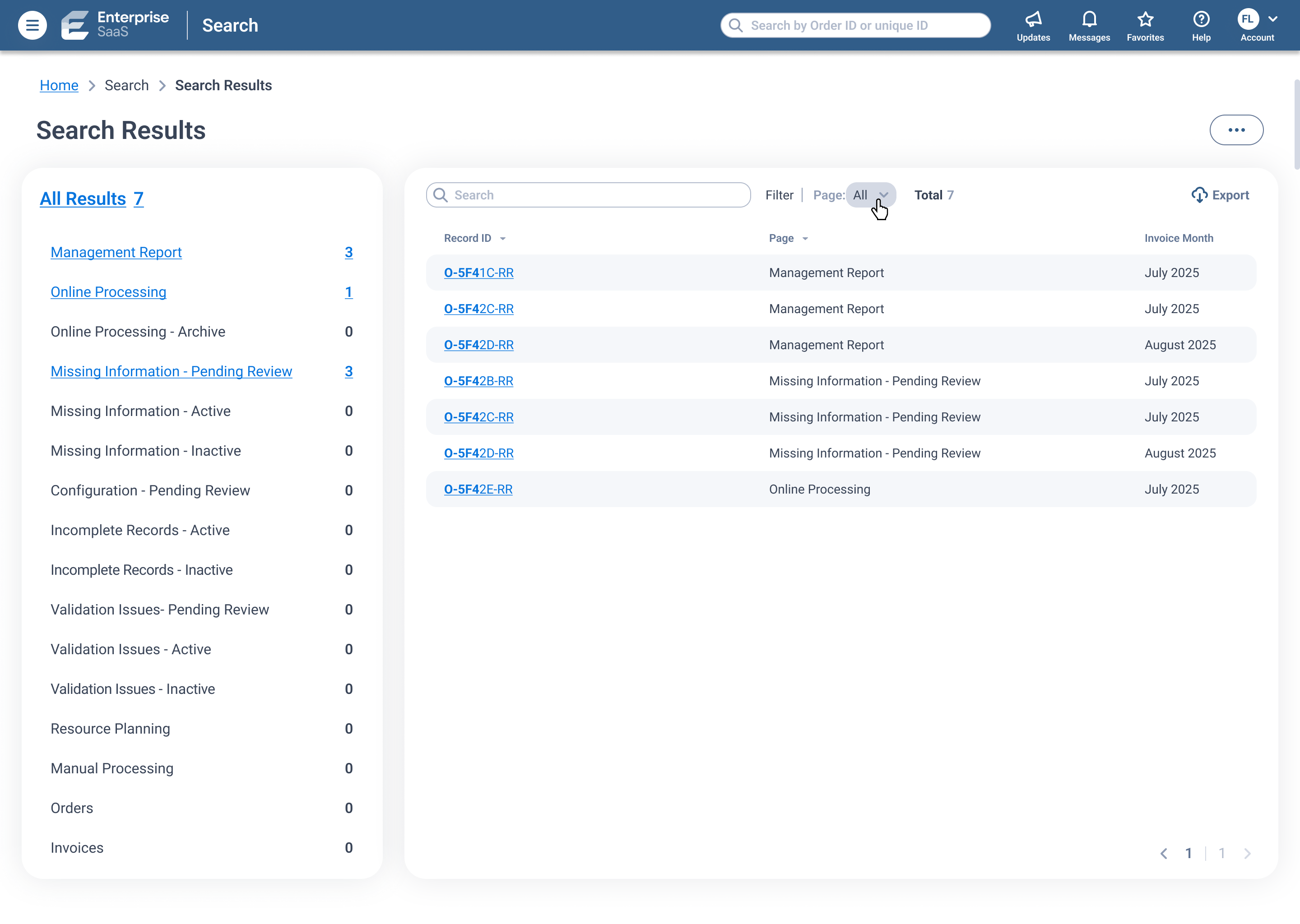
Search Results was designed so people could locate a record without first understanding the application’s structure, including a working prototype that explored a second way of presenting those results.
Interaction
Making the consequence of a change visible before it is committed
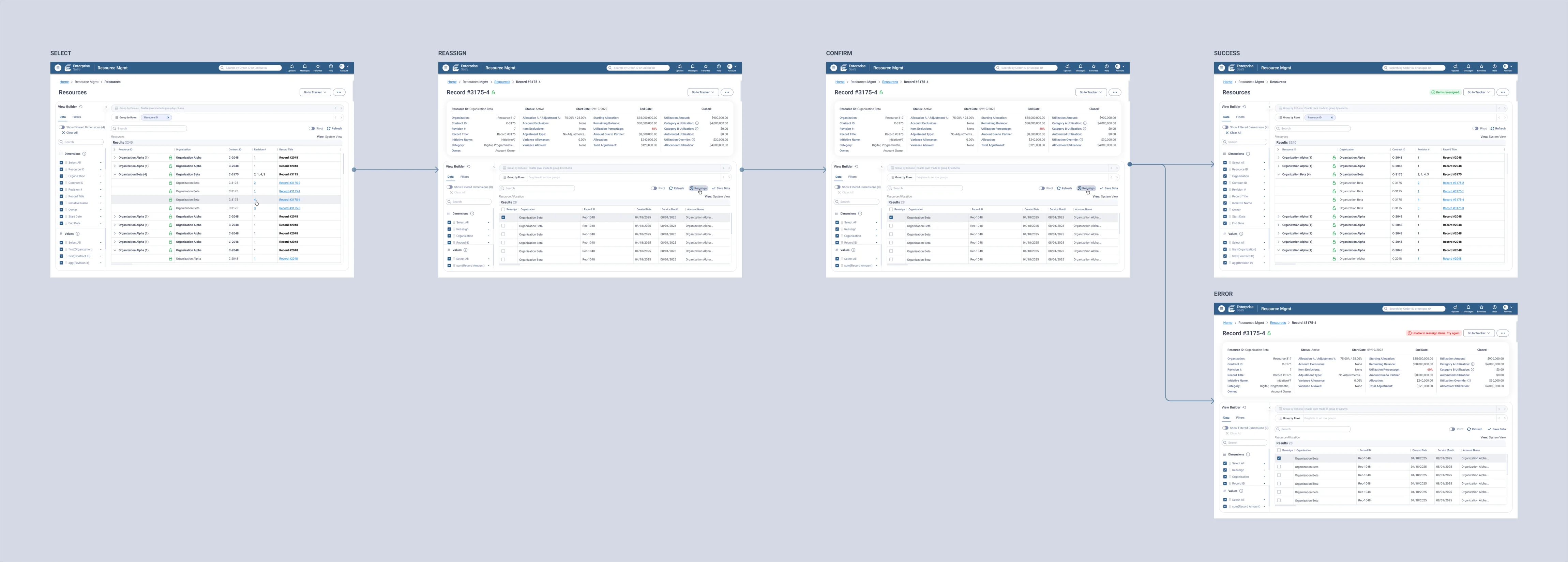
Some workflows changed ownership or assignment of existing records and could affect downstream data. The interaction had to show what would happen before the change was committed, then keep confirmation, success, error and in-progress status inside the same flow.
Select
Identify the records affected by the action.
Reassign
Select the new resource.
Confirm
The system communicates what will change before commit.
Feedback
Success and error states keep the outcome in the workflow.
System feedback
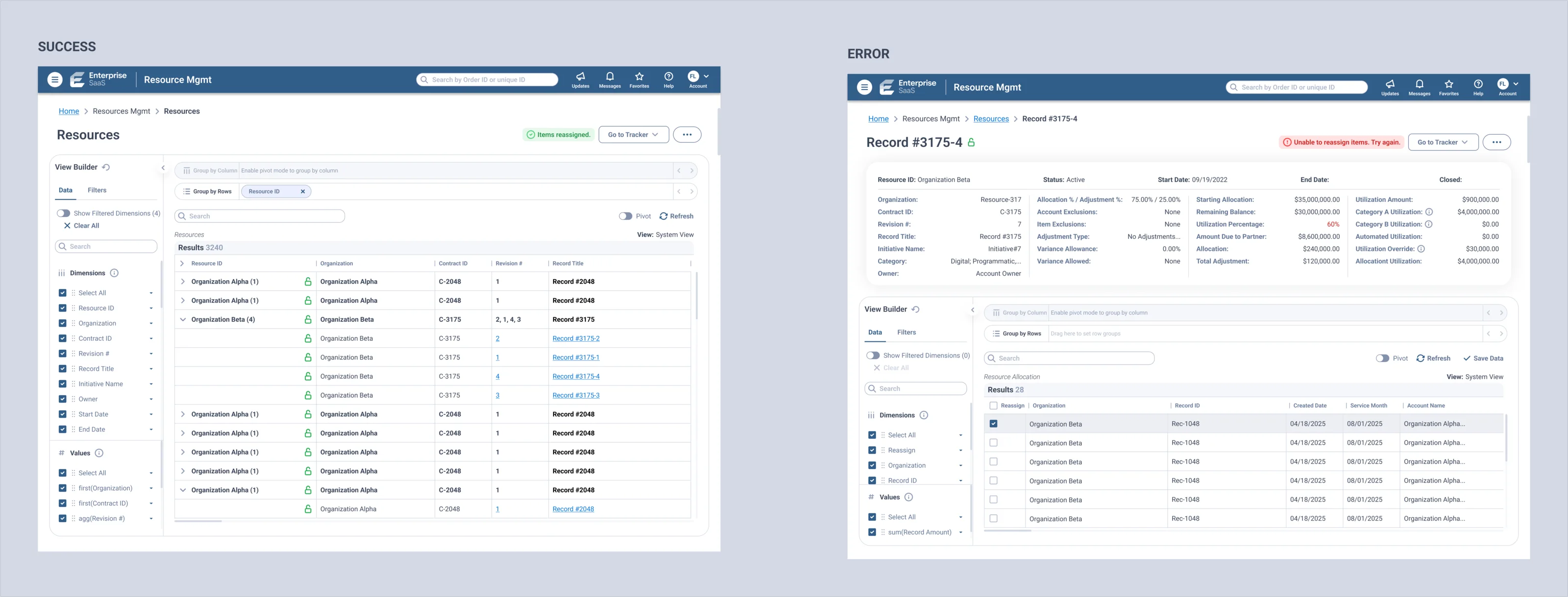
Making outcomes explicit
Confirmation, success, error and system status make the result of an action visible. They do not replace the need to make the consequence of a change clear before it is committed.
Design System
From an inherited foundation to a working platform library
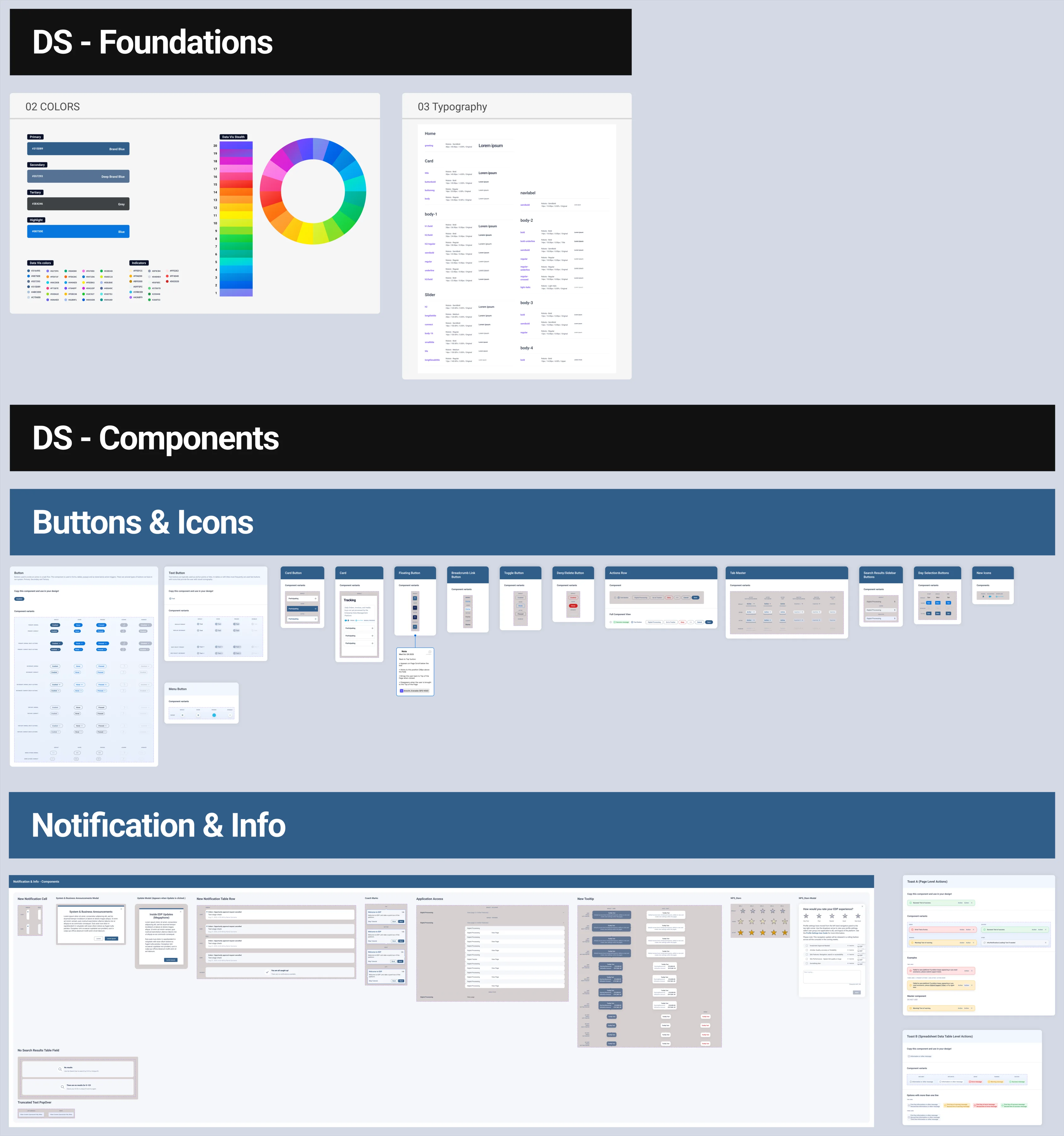
An existing enterprise Design System provided the starting point. I expanded it into a platform-specific component library: tables and table headers, controls, rows, filters, contextual actions, and a clearer split between universal actions and the few that vary by context.
Some inherited components had unclear affordances. Search Fields, Dropdowns and Toggles were refined so those patterns behaved the same way across the product.
The platform-specific library was introduced progressively in staging and production, and became the reference for later feature design and implementation. This component-library work was distinct from the proposed table-model and View Builder changes, whose implementation remained hybrid.
Outcome
A foundation the product could keep building on
Reflection
The product was the system, not the screens
The useful work was not a set of redesigned screens. It was making the relationships between information architecture, roles, tables, navigation, system behavior and reusable components explicit enough to design as one product.
Selected screens and artifacts have been sanitized for confidentiality. Product names, identifiers, data and operational parameters have been modified or replaced; the underlying UX architecture and design approach are represented accurately.